Просмотр новости
Найдите то, что Вас интересует
 Спутники
 РН
 SpaceX
 Роскосмос
 NASA
СпутникиРНSpaceXРоскосмосNASADiscover the rich colours of a Pumpkin Palette and bring the warmth of autumn into your home...
The post Pumpkin Palette appeared first on Kit Kemp Design Studio.
As autumn arrives, the landscape begins to shift. Leaves turn from green to rich shades of red, orange and ochre, the days grow cooler and our attention naturally turns towards home. It is the perfect season to embrace deeper, warming tones, from burnt orange and ochre to rich reds and subtle spice shades, bringing the colours of the changing landscape indoors.
Autumn does not have to mean dark, heavy interiors. Richer shades can be balanced with crisp patterns, lighter tones and plenty of natural light, creating rooms that feel warm and layered without becoming too weighty.
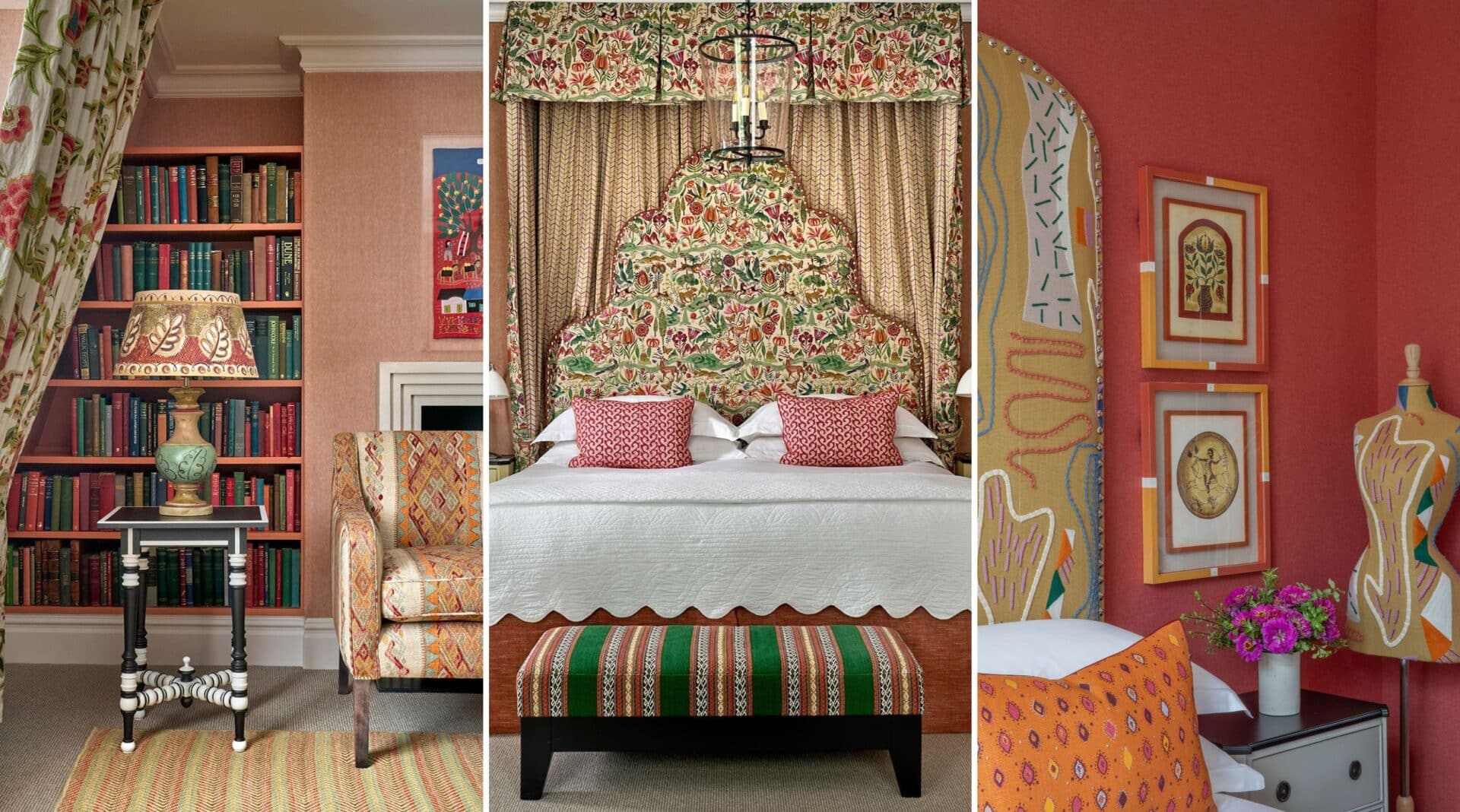
In this bedroom at Knightsbridge hotel, an embroidered fabric headboard introduces rich touches of red and green, bringing warmth and pattern to the space.
To keep the scheme feeling fresh, the walls are dressed in an orange and white pinstripe. Its crisp lines lift the deeper tones of the room, while adding a more tailored feel. Our classic Chainstitch fabric in a natural colourway brings the palette together, balancing the richer shades with a lighter, softer feel.
Our latest fabric collection with Chelsea Textiles captures the spirit of autumn in a more delicate way. Set against a soft green ground, hand-embroidered mushroom motifs appear in varying scales, creating a detailed pattern that feels perfectly at home this time of year.
Allowing the headboard to take centre stage, the rest of the room is layered with soft oranges and warming spice tones. The result is a scheme that feels inviting and restful, while allowing the embroidery and colour to remain the focus.
Less expected and a little more daring, Room 1202 at The Whitby Hotel explores the richer side of a Pumpkin Palette, bringing together ochres, spice tones and burnt orange. The bold headboard has the quality of a contemporary artwork, with organic shapes, vibrant colour and intricate embroidery creating a strong focal point.
Flooded with natural light, the room takes on a bright, optimistic quality. Bold artwork is balanced by grounding furniture, showing how warm, saturated colours can bring depth and character without making a space feel enclosed.
Autumn is the perfect time to bring richer colour, texture and pattern into the home. From deep spice tones to embroidered details and layered textiles, a warmer palette can transform a room while still keeping it feeling fresh. It is all about finding the right balance between colour, pattern and texture, allowing each element to have its place as the seasons change.
| # | Наименование новости | Тональность | Информативность | Дата публикации |
|---|---|---|---|---|
| 1 | The Fabric of the Season | 0 | 8.31 | 08-10-2026 |
| 2 | How to Be Creative at Home this Autumn | 0 | 7.77 | 21-10-2026 |
| 3 | What’s On This Autumn: Join Us for a Series of Events | 0 | 5.68 | 21-10-2026 |
| 4 | Colour Blocking | 0 | 10.4 | 30-09-2026 |
| 5 | Five Easy Ways to Refresh Your Bedroom This October | 0 | 5.66 | 01-10-2026 |
| 6 | Finding Design Inspiration Closer to Home | 0 | 7.41 | 07-10-2026 |
| 7 | Turning Over a New Leaf: Leaves in Design | 0 | 7.4 | 15-10-2026 |
| 8 | Spotlight on the Pixie Table | 0 | 9.43 | 08-10-2026 |
| 9 | Take a Seat | 0 | 9.85 | 15-10-2026 |
| 10 | Why Texture Matters | 0 | 10.38 | 21-10-2026 |