Просмотр новости
Найдите то, что Вас интересует
 Спутники
 РН
РН SpaceX
 Роскосмос
 NASA
NASA
СпутникиРНSpaceXРоскосмосNASAThe new Apple Music album and playlist design introduced with iOS 26.4 has a lot of fans, but is drawing the ire of some hardcore dark mode users. Now that the colors of the interface adapt to match the album art, screens can be very bright at night if you tap on an album that features mostly white or other light-colored backgrounds.
For users that rely on dark mode to keep the phone screen dark at night time, these interface ‘flash bangs’ are triggering frustrations.
more…
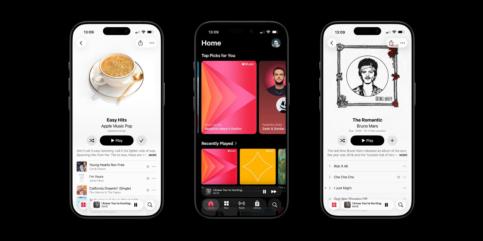
The new Apple Music album and playlist design introduced with iOS 26.4 has a lot of fans, but is drawing the ire of some hardcore dark mode users. Now that the colors of the interface adapt to match the album art, screens can be very bright at night if you tap on an album that features mostly white or other light-colored backgrounds.
For users that rely on dark mode to keep the phone screen dark at night time, these interface ‘flash bangs’ are triggering frustrations.
Although it may seem like a trivial complaint, the Apple Music subreddit has been blowing up with these criticisms ever since 26.4 came out. Obviously, some users are more sensitive to this than others.
A true fix for the flash bangs will need Apple to update its software. Perhaps, the system could pick from a palette of dim colors when the device is in dark mode. Maybe, Apple could offer a setting that optionally tweaks the behavior for dark mode users.
One possible workaround to try right now is to use the Increase Contrast accessibility option for Apple Music. This forces Apple Music to be less aggressive with its adaptive theming. With Increase Contrast on, the background for album song lists remains black in dark mode.
This is how the UI appears for light themed album artwork, when Increase Contrast is enabled:
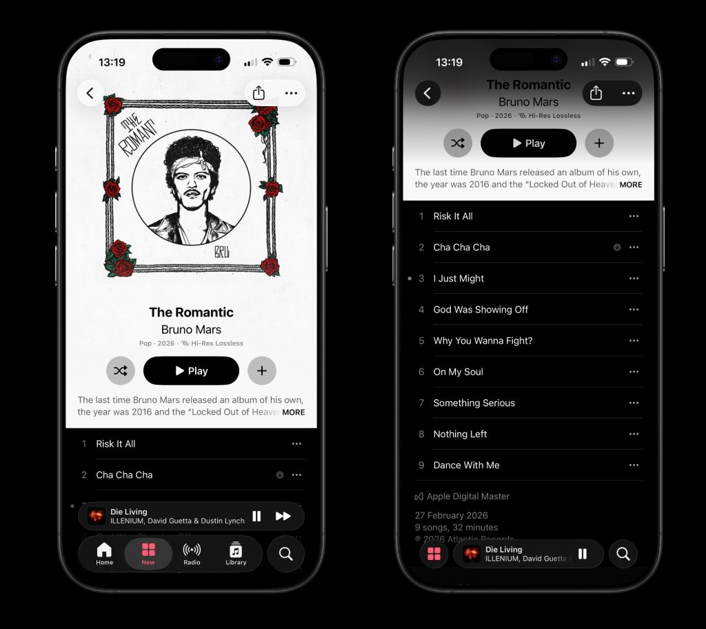 Apple Music in dark mode with the Increase Contrast accessibility option enabled
While the top region still bleeds the white color edge-to-edge, the track list is presented in the traditional dark mode appearance with white text on a black background.
You can enable the Increase Contrast mode by navigating to Settings -> Accessibility -> Display & Text Size -> enable the toggle for Increase Contrast … but this applies system-wide.
You can also enable Increase Contrast just for the Apple Music app, which is probably preferable. Navigate to Settings -> Accessibility -> Per-App Settings -> Add App -> Apple Music, and enable the Increase Contrast toggle here to scope the change only to the Music app.
If you want to undo this later, you can go back to Accessibility settings, edit the Per-App Settings list and delete all the customizations for Apple Music.


FTC: We use income earning auto affiliate links. More.

| # | Наименование новости | Тональность | Информативность | Дата публикации |
|---|---|---|---|---|
| 1 | Apple Music in iOS 26.4 has new design for albums, playlists, and more | 0 | 18.89 | 25-03-2026 |
| 2 | Apple Music in iOS 26.4: Five brand new features available now | 0 | 19.81 | 27-03-2026 |
| 3 | Apple Music in iOS 27 introduces new design changes in two key areas | 0 | 18.42 | 19-06-2026 |
| 4 | This is Apple Music’s new logo, probably | 0 | 27.87 | 05-10-2026 |
| 5 | iOS 27: Here’s all the new Apple Music features | 0 | 20.83 | 10-06-2026 |
| 6 | Apple releases iOS 26.4 with 8 new emoji and 12 more changes to your iPhone | 0 | 20.52 | 24-03-2026 |
| 7 | Apple Music outage makes service unavailable to some users [U] | 0 | 15.45 | 16-04-2026 |
| 8 | Apple Music outage confirmed in multiple countries [U: Fixed] | 0 | 19.98 | 29-05-2026 |
| 9 | Apple Music Replay 2026 now live, here’s how to find it | 0 | 19.99 | 03-02-2026 |
| 10 | Apple Music suffering second outage in two weeks [Update: Resolved] | 0 | 18.98 | 20-04-2026 |